


Building a Modern WordPress Blogger Cards Plugin with Web Components
Updated 2025
In this updated tutorial, I’ll show you how to create a production-ready Blogger Cards plugin for WordPress that displays user information in beautiful, interactive cards. This 2025 edition includes modern best practices, Gutenberg block support, accessibility features, and responsive design.
What We’ll Build
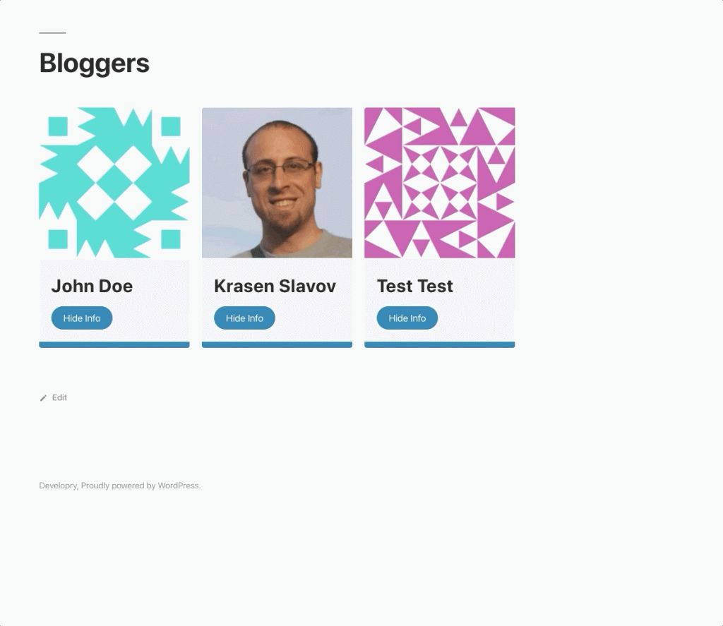
A WordPress plugin that displays authors and subscribers using interactive cards built with Web Components. The plugin features:
- Native Gutenberg block integration
- Shortcode support for backward compatibility
- Full accessibility with ARIA labels and keyboard navigation
- Responsive design with a mobile-first approach
- Dark mode support
- Modern JavaScript (ES6+) and CSS features
- Security hardening with proper escaping and sanitization
You can extend this code to fit your needs, show single-user cards in blog posts, or integrate it directly into your theme.
Why Web Components?
Web Components provide encapsulation through Shadow DOM, making our user cards reusable and isolated from theme styles. This architectural pattern separates client and server-side code, making it easier to maintain and scale larger projects.
For more about Web Components, check out MDN’s Web Components documentation.
Download the complete plugin code from GitHub.
Project Structure
blogger-cards/
├── assets/
│   ├── card.css          # Grid and global styles
│   └── card.js           # Web Component definition
├── templates/
│   └── card.tpl.php      # Template for rendering cards
├── block.json            # Gutenberg block configuration
├── blogger-cards.php     # Main plugin file
└── index.php             # Security file
The Main Plugin File
Let’s start with blogger-cards.php. This is where we register our assets, shortcode, and Gutenberg block.
Modern Asset Loading
function blogger_cards_enqueue_assets() {
    $plugin_version = '1.0.0';

    wp_enqueue_style(
        'blogger-cards',
        plugins_url( 'assets/card.css', __FILE__ ),
        array(),
        $plugin_version,
        'all'
    );

    wp_enqueue_script(
        'blogger-cards',
        plugins_url( 'assets/card.js', __FILE__ ),
        array(),
        $plugin_version,
        array(
            'strategy'  => 'defer',
            'in_footer' => true,
        )
    );
}
add_action( 'wp_enqueue_scripts', 'blogger_cards_enqueue_assets' );
What’s New in 2025:
- Using
deferstrategy for better performance - Proper versioning for cache busting
- Named functions instead of anonymous closures for better debugging
Shortcode with Attributes
function blogger_cards_shortcode( $atts ) {
    $atts = shortcode_atts(
        array(
            'roles' => 'author,subscriber',
            'limit' => -1,
        ),
        $atts,
        'display_users'
    );

    ob_start();
    include plugin_dir_path( __FILE__ ) . 'templates/card.tpl.php';
    return ob_get_clean();
}
add_shortcode( 'display_users', 'blogger_cards_shortcode' );
This allows flexible usage:
[display_users]– Default: all authors and subscribers[display_users roles="author" limit="6"]– First 6 authors only[display_users roles="editor,contributor"]– Multiple specific roles
Gutenberg Block Registration
function blogger_cards_register_block() {
    if ( ! function_exists( 'register_block_type' ) ) {
        return;
    }

    register_block_type(
        __DIR__ . '/block.json',
        array(
            'render_callback' => 'blogger_cards_shortcode',
        )
    );
}
add_action( 'init', 'blogger_cards_register_block' );
We reuse the same render callback for both shortcode and block, maintaining consistency.
The Template File
The template file (templates/card.tpl.php) handles security and data processing:
Security First
defined( 'ABSPATH' ) || exit;

// Parse and sanitize inputs
$roles = isset( $atts['roles'] ) ? explode( ',', $atts['roles'] ) : array( 'author', 'subscriber' );
$roles = array_map( 'trim', $roles );
$limit = isset( $atts['limit'] ) ? intval( $atts['limit'] ) : -1;
Proper Data Escaping
<user-card
    name="<?php echo esc_attr( $display_name ); ?>"
    avatar="<?php echo esc_url( $avatar_url ); ?>"
>
    <div slot="email"><?php echo esc_html( $user->user_email ); ?></div>
    <div slot="url">
        <?php if ( ! empty( $user->user_url ) ) : ?>
            <a href="<?php echo esc_url( $user->user_url ); ?>"
               target="_blank"
               rel="noopener noreferrer">
                <?php echo esc_html( $user->user_url ); ?>
            </a>
        <?php else : ?>
            <?php esc_html_e( 'Not provided', 'blogger-cards' ); ?>
        <?php endif; ?>
    </div>
</user-card>
Security improvements:
esc_attr()for HTML attributesesc_url()for URLsesc_html()for text contentwp_kses_post()for formatted bio content- Proper
rel="noopener noreferrer"for external links
The Web Component
Our card.js file defines the custom <user-card> element with modern JavaScript:
Modern Class Structure
class BloggerCard extends HTMLElement {
    constructor() {
        super();
        this.showInfo = false;
        this.attachShadow({ mode: 'open' });
        this.shadowRoot.appendChild(template.content.cloneNode(true));
    }

    connectedCallback() {
        this.render();
        this.attachEventListeners();
    }

    disconnectedCallback() {
        this.detachEventListeners();
    }

    static get observedAttributes() {
        return ['name', 'avatar'];
    }

    attributeChangedCallback(name, oldValue, newValue) {
        if (oldValue !== newValue) {
            this.render();
        }
    }
}
Modern JavaScript features:
- Proper lifecycle methods
- Attribute observation for reactive updates
- Clean event listener management
textContentinstead ofinnerHTMLfor security
Accessibility Features
toggleUserInfo() {
    this.showInfo = !this.showInfo;
    const userInfo = this.shadowRoot.querySelector('.user-card__info');
    const toggleButton = this.shadowRoot.querySelector('.user-card__info-toggle');

    if (this.showInfo) {
        userInfo.setAttribute('aria-hidden', 'false');
        toggleButton.setAttribute('aria-expanded', 'true');
        toggleButton.textContent = 'Hide Info';
    } else {
        userInfo.setAttribute('aria-hidden', 'true');
        toggleButton.setAttribute('aria-expanded', 'false');
        toggleButton.textContent = 'Show Info';
    }
}
Accessibility improvements:
- ARIA labels and states
- Semantic HTML with proper roles
- Keyboard navigation support
- Screen reader friendly
- Alt text for images
- Focus management
Modern CSS
The card.css file uses modern CSS features:
CSS Custom Properties
:root {
  --blogger-card-primary: #0073aa;
  --blogger-card-primary-dark: #005a87;
  --blogger-card-white: #ffffff;
  --blogger-card-bg: #f2f1f1;
  --blogger-card-text: #333333;
  --blogger-card-spacing: 1.25rem;
}
Users can override these in their theme for easy customization.
Responsive Grid
.grid {
  display: grid;
  gap: var(--blogger-card-spacing);
  grid-template-columns: repeat(auto-fill, minmax(min(100%, 280px), 1fr));
  align-items: start;
}

@media (min-width: 768px) {
  .grid {
    grid-template-columns: repeat(auto-fill, minmax(300px, 1fr));
  }
}
Modern Features in card.js Styles
.user-card img {
  width: 100%;
  aspect-ratio: 1 / 1;
  object-fit: cover;
}

.user-card h3 {
  font-size: clamp(1.25rem, 4vw, 1.5rem);
}

@media (prefers-reduced-motion: reduce) {
  .user-card,
  .user-card button {
    transition: none;
  }
}

@media (prefers-color-scheme: dark) {
  .user-card {
    background: var(--blogger-card-bg, #2c2c2c);
    color: var(--blogger-card-text, #e0e0e0);
  }
}
Modern CSS features:
aspect-ratiofor consistent image dimensionsclamp()for fluid typography- Container queries support
prefers-reduced-motionfor accessibilityprefers-color-schemefor automatic dark mode- Smooth animations with proper fallbacks
Using the Plugin
As a Gutenberg Block
- Edit any page or post
- Click ‘+’ to add a new block
- Search for “Blogger Cards”
- Configure options in the sidebar
As a Shortcode
Add to any page or post:
[display_users]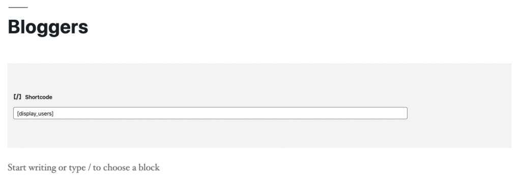
[display_users roles="editor,author,contributor"]
Extending the Plugin
The modular architecture makes it easy to extend:
- Add new user fields – Edit the template file and add slots
- Custom styling – Override CSS custom properties in your theme
- Additional attributes – Add to
block.jsonand handle in the shortcode - Different layouts – Modify the grid CSS or create multiple templates
Conclusion
This modernized Blogger Cards plugin demonstrates how to build production-ready WordPress plugins in 2025. The combination of Web Components, modern JavaScript, accessible design, and Gutenberg integration creates a robust, maintainable solution.
The same architectural approach works excellently for larger projects with multiple features and components. The separation of concerns between client and server-side code makes the plugin easy to extend and maintain.
Download the complete code from GitHub.
Resources
- Web Components Documentation
- WordPress Block Editor Handbook
- WordPress Plugin Developer Handbook
- WCAG Accessibility Guidelines
Happy coding! 🚀